
Brand Guidelines · Edition 01 · July 2026
Maison Riv
Atelier Direct
Democratizing great design. This guide is the single source of truth for how the house looks, speaks, and behaves — on the site, in photography, and everywhere the name appears.
01 · The House
Great design was never meant to be a luxury good.
Maison Riv was founded in New York by interior designers who spent a decade furnishing beautiful homes. We commission gallery-grade furniture from the same ateliers that supply the world's most celebrated design houses and bring it straight to the client — no gallery doors, no licensing fee, no designer markup. You pay for the craft, not the gatekeeping.
The brand carries that promise visually: warm editorial neutrals, one clay accent, an unhurried serif, photography of real rooms in natural light. Everything is quiet, honest, and material — the furniture is the star; the brand recedes.
{{ p.num }}
{{ p.title }}
{{ p.body }}
02 · Logo & Wordmark
Typography is the logo.
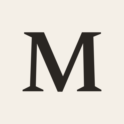
The wordmark is Spectral Regular, set in capitals and tracked to 0.18em — the same weight the site header uses. The full lockup adds the "Atelier Direct" descriptor in Hanken Grotesk at 0.35em tracking, 60% opacity. The monogram — a single Spectral M on an ink tile — is the mark for favicons, app icons, and stamps. Never redraw, re-track, or re-set either.
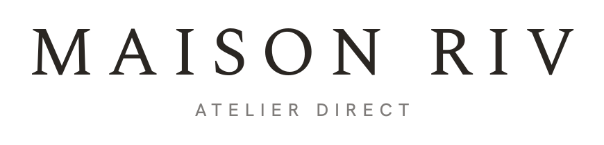

 CLEARSPACE = CAP HEIGHT OF "M"
Rules
- Ink on bone/cream, or bone on ink/espresso/photography. No other colorways.
- Minimum size: wordmark 120px wide on screen; monogram 16px.
- Over photography, always sit the logo on a scrim (ink at 40–70%).
- Never add effects, outlines, gradients, or containers with rounded corners.
- The monogram is one letter on purpose — "MR" turns to mush at 16px.
Asset library
Six marks, five formats.
Every file below is generated from the same typeset source, so nothing drifts. The type is converted to outlines — SVGs and PDFs carry no font dependency and open correctly in any browser or design tool.
PNGs are transparent at every size — the number is the pixel width. JPGs are flattened onto the brand background for tools that reject an alpha channel. Reach for SVG or PDF whenever the destination will take vector.
Favicon & app icons
The monogram, down to 16px.
The favicon is the monogram — bone M, full-bleed ink tile, no padding and no rounding. The tile does the work of a container, so the mark still reads at a tab's 16 pixels. This page uses these exact files.
Actual size
In a tab
 ×
×
03 · Color
Warm editorial neutrals, one clay accent.
The palette is a room in afternoon light: bone walls, sand hairlines, ink type, and a single terracotta accent used sparingly. A page uses at most two background colors. Click any swatch to copy its hex.
{{ group.title }}
Brass is the only accent. Use it for numerals, star ratings, focus rings, and small marks of emphasis — never for large fills, buttons, or backgrounds. Brass Soft is its on-dark and hover form.
Sage is quieter still. Reserved for savings lines and verified-buyer badges. If a layout needs a third color, the layout is wrong.
04 · Typography
An unhurried serif, a quiet sans.
Display · Spectral
Aa Bb Cc 0123
The pieces you covet. Without the markup.
Headlines, product names, pull quotes, large numerals. Weights 300–600, italic for inflection. Always letter-spaced −0.01em at display sizes. Never used for UI labels or body copy.
UI & Body · Hanken Grotesk
Aa Bb Cc 0123
We commission gallery-grade furniture from the same ateliers that supply the world's most celebrated design houses.
Body copy, buttons, labels, navigation, captions. Weights 400–600. Uppercase labels are tracked 0.2–0.35em — the wider the smaller the type.
{{ t.name }}
{{ t.spec }}
{{ t.sample }}
Both families are open source (OFL). The full family files — every weight and italic — are on Google Fonts.
05 · Voice & Tone
Confident, honest, unhurried.
We write like a designer who knows the makers personally — direct about price, reverent about craft, never breathless. Short declaratives. No exclamation marks. Copy earns trust by being specific: name the atelier, the material, the saving.
{{ v.title }}
{{ v.body }}
Say
- "The pieces you covet. Without the markup."
- "You pay for the craft, not the gatekeeping."
- "Save $2,400 (46%) vs. traditional retail."
- "Live with it for 100 nights; return it if it's not right."
Never say
- "Luxury for less!!"
- "Dupes of designer furniture"
- "Cheap" / "discount" / "knock-off"
- "Hurry — sale ends soon!"
We are not a discounter and never compare ourselves to knock-offs. The comparison is always to the gallery version — same atelier, same spec, honest price.
Vocabulary
atelier, not factory or supplier
commission, not order or manufacture
the house, when the brand refers to itself
client, not customer or user
piece, not product or item
honest price, not cheap or affordable
06 · Photography
Real rooms, natural light.
Photography looks like a client's home the morning after delivery — lived-in, warm, and side-lit. Fog, sand, and mocha upholstery against plaster, oak, and stone. No studio sweeps for hero imagery; packshots on Cream are reserved for the product grid.
Light. Window light only, ideally raking. Shadows stay warm and soft; never flash, never HDR.
Styling. A book, a throw, a ceramic — signs of life, never clutter. No people in catalogue imagery.
Grade. Warm neutral grade matched to the palette. Whites lean bone, never blue. Modest contrast, true blacks reserved for ink.
Order. In product galleries the packshot leads, the lifestyle shot follows — it is the hover preview.
07 · UI Components
Sharp corners, hairlines, restraint.
No rounded containers, no drop shadows, no filled accent buttons. Structure comes from 1px Sand hairlines and generous space. Radius is 0 everywhere except swatch dots and carousel indicators.
Buttons
Primary: Ink fill → Espresso hover. On photography: Bone fill with Ink text. 12px / 500 / 0.2em tracking / 16×32 padding. Never Brass.
Form fields
Subscribe
Boxed fields: Input fill + Line border, radius 0. Newsletter fields are a bare underline. Focus ring: 2px Brass, offset 2px. Placeholders in Stone.
Product card

Sofas
The Nuage Sofa
From $2,890
$5,400
★★★★★ 4.9 (128)
Save $2,510 (46%) vs. traditional retail
3:2 image, category eyebrow in Clay, serif title, price right-aligned with strikethrough comparable in Stone, savings line in Sage. Image zooms 1.05 on hover over 1.1s.
Labels & dividers
Section eyebrow
Section heading follows
- Frame
- FSC-certified oak
- Upholstery
- Belgian linen, Fog
Eyebrows: 12px, 0.3em, uppercase, Clay. Spec lists: label in Clay, value in Ink, Sand hairline rows. Dividers are always 1px Sand — never heavier.
08 · Spacing & Layout
Space is the luxury.
- {{ s.label }}
- {{ s.value }}
12-column grid inside a 1400px container. Content columns cap at 820px for reading, 1120px for documentation.
Sections breathe: 80px of vertical padding minimum, 112px on desktop. Editorial imagery is 4:5 portrait or full-bleed wide; product imagery is always 3:2. When in doubt, remove an element and add space.
09 · Iconography
Thin-line, never filled.
Icons are Heroicons Outline at stroke-width 1 — drawn light so they read as etching, not UI chrome. Ink on light surfaces, Brass Soft on dark. Used only where they carry meaning: trust signals, navigation, controls. Never decorative, never emoji.
{{ ic.label }}
On dark
Source: heroicons.com — Outline set, MIT-licensed. 24px artboard rendered at 28–30px.
10 · Email
The house, at 600 pixels.
Email is the brand guide compressed into a 600px column: the same tokens, the same serif, the same restraint. Two mastheads cover every send, headlines over photography are baked into the hero image so every inbox renders them, and everything else stays live text on Bone and Cream bands separated by Sand hairlines.
Masthead D · Full Bleed — the default
The photograph runs from the very top edge; the bone lockup sits on it over an ink scrim, the headline bottom-left. Baked as one retina image so it renders identically in every client. Use whenever the image's upper region is calm enough to hold the logo.
Masthead C · Gallery — the fallback
For imagery too light or busy for a logo overlay: hairline-flanked ink lockup on Bone, a centered statement with a Brass eyebrow, then the image in a Cream mat with a small-caps caption — the composition of the print ads.
Every email sells a piece
The case-in-point card is the workhorse: packshot, Brass eyebrow, Spectral name, one-line description, Traditional retail struck through in Stone beside the Maison Riv price, a Sage savings line — "You save $2,210 (49%) — same atelier, same solid wood." — and one ink button.
Type degrades gracefully
Spectral and Hanken Grotesk load where the client allows; Georgia and Helvetica stand in everywhere else. That is why headlines over photography are baked into the image — the masthead never depends on a webfont surviving Gmail.
The footer is fixed
Every send ends on the Espresso panel: bone lockup, four links (Manifesto · Sourcing · 100-Night Trial · Contact), then the mailing address, Unsubscribe, and Email preferences. The compliance links are law, not layout — never removed, never restyled into invisibility.
Imagery ships from the CDN
Product cards use the textured fronts, heroes and feed tiles use lifestyle shots — all served from the Shopify CDN at twice display size, with square crops done server-side. New shots are generated to the photography rules, approved, then uploaded before use.
600px column·Bone canvas·Sand hairlines·Sage for savings only·No exclamation marks·One idea per send
The welcome series (four sends, day 0–9, with an A/B pair on the third) and the campaign tooling live in the site repository under welcome-emails/ — copy, layout, imagery, and the Klaviyo upload run end to end through the campaign-emails skill.
{{ copiedText }}